

Prakriti Pavani's Electric Blue: Mastering Bold Color Combos in Denim
Electric blue meets relaxed denim. Prakriti Pavani utilizes ruched texture and unexpected orange accents for a high-impact, casual look.
By Isla Brandt·Published
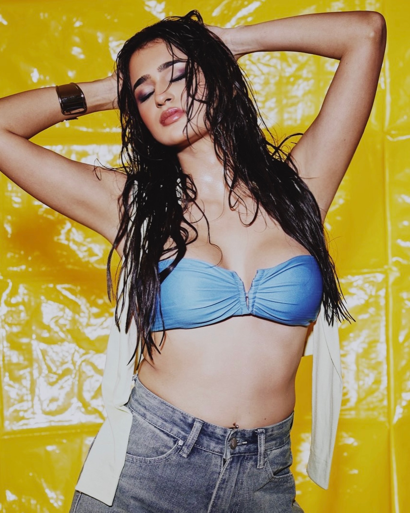
Prakriti Pavani’s recent fashion presentation foregrounds a dynamic interplay of saturated color and varied silhouettes. The look is built around a core trio: electric blue, soft ivory, and warm orange, set against a vivid yellow backdrop. This aesthetic eschews complicated accessories, allowing the strength of the color combinations and garment construction to carry the focus.
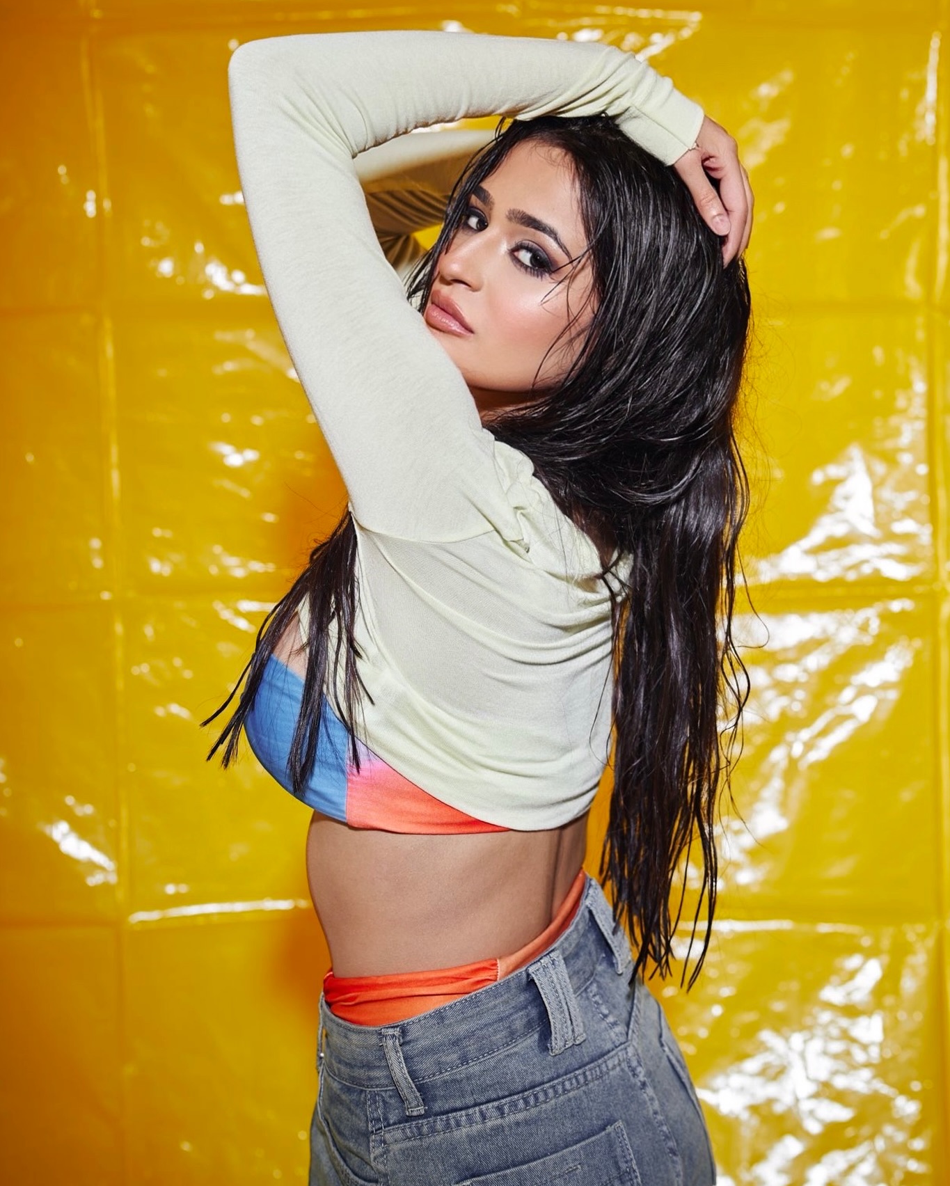
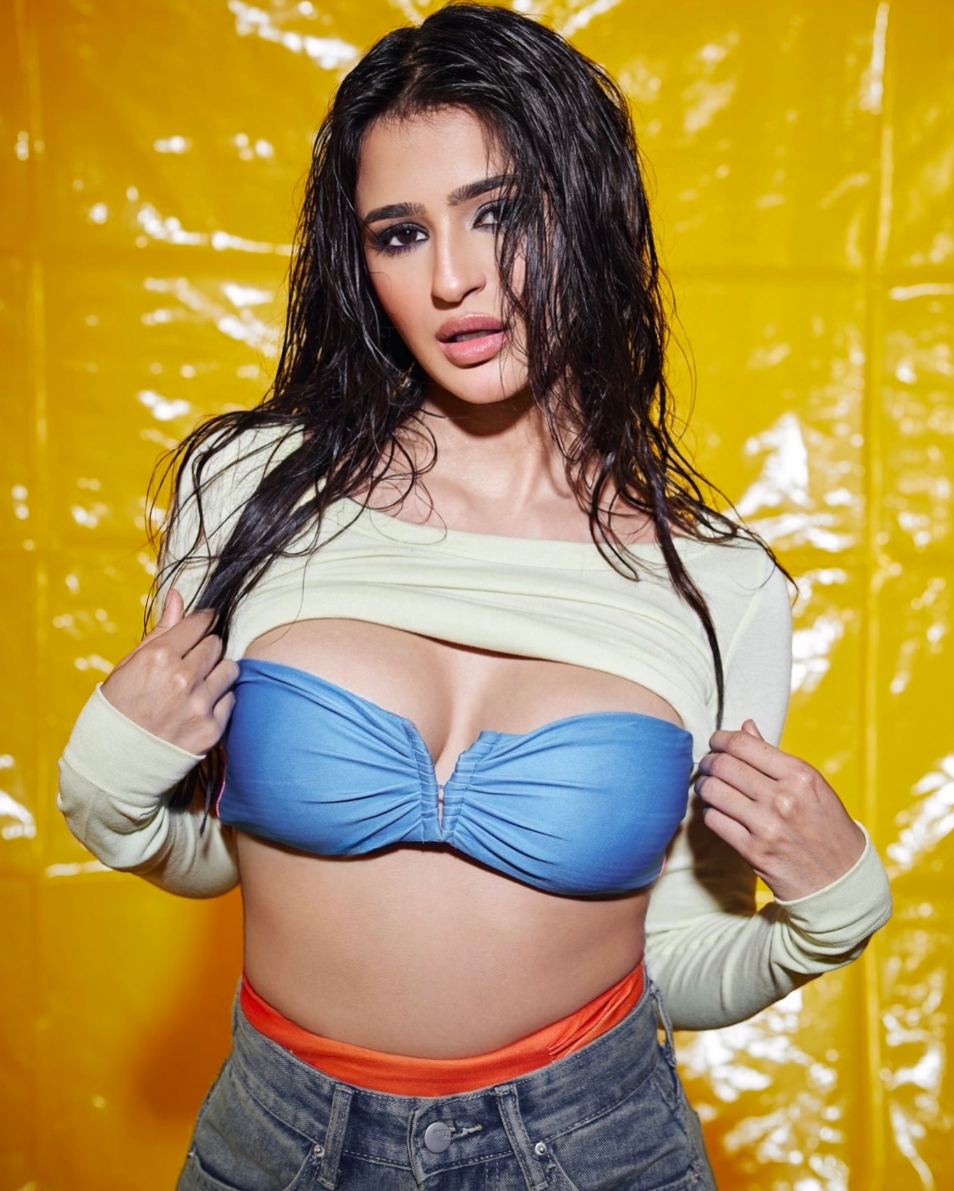
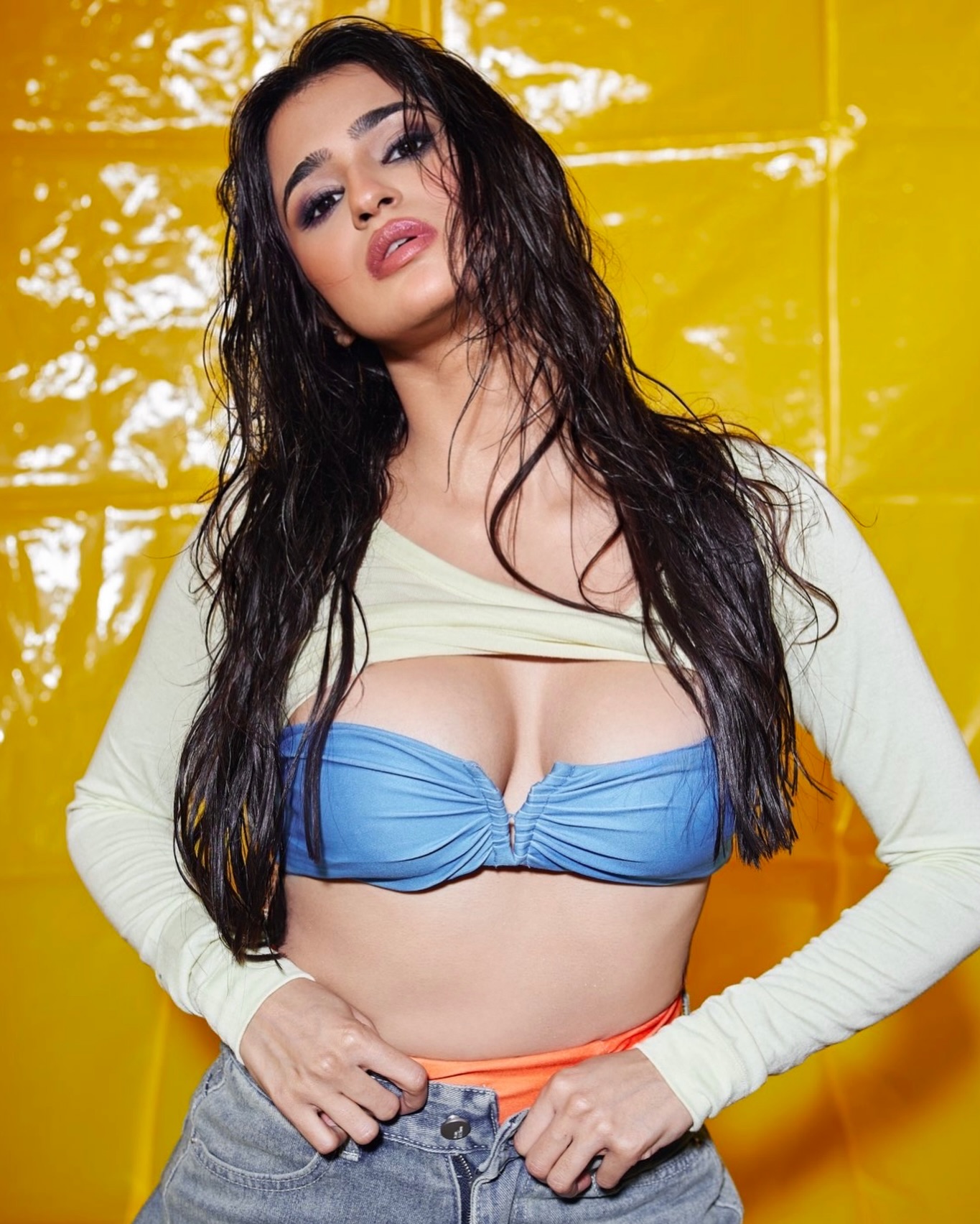
In this styling narrative, Prakriti Pavani transforms standard casual separates into a playful editorial moment. The combination relies on the visual energy generated by the electric blue top, which features a softly ruched finish, providing texture and shape. This statement piece is anchored by a pair of relaxed denim jeans, which ground the look in a familiar, comfortable silhouette. The inclusion of an ivory layer, draped throughout the frames, introduces movement and a subtle shift in visual weight.
What makes the styling particularly effective is the deliberate introduction of the orange accent. This hue, seen in the footwear or subtle details, serves as a point of sharp contrast. It prevents the electric blue and ivory from settling into a predictable palette, injecting a deliberate burst of warmth. The resulting visual is one of considered simplicity—a formula where a single, bright statement piece is supported by foundational wardrobe staples.
Photo Gallery
 The precise cut of the black crepe suit showcases severe tailoring and a defined silhouette. The structure of the jacket relies heavily on the fabric’s weight, maintaining sharp shoulder lines and a sharp waistline. This monochromatic presentation avoids superficial color commentary, instead focusing on the interplay between the matte finish and the sharp pleating. The garment’s construction demonstrates a commitment to formal, architectural dressing, favoring geometric lines over softer draping. It is an aesthetic of controlled form and deliberate shape.
Courtesy: @prackritipavani/Instagram
 Observe the dramatic fluidity of the burnt orange georgette. This fabric, known for its excellent drape and sheer quality, translates into a highly mobile evening wear piece. The high slit introduces a sharp vertical line that breaks the otherwise uniform flow of the textile. The color—a deep, rich terracotta—is rendered with saturation, allowing the light to play across the crinkled surface of the silk. This ensemble prioritizes movement and a complex, textured surface over rigid structure.
Courtesy: @prackritipavani/Instagram
 Indigo tones are treated here with textural complexity. The cotton-silk blend kurti utilizes a relaxed silhouette, which is elevated by the intricate embroidery detail along the cuffs. This specific weaving technique lends a subtle, uneven surface quality that contrasts the smooth dye. The indigo hue is deep, suggesting a vat dye process. The garment’s design leans into artisanal complexity, proving that comfort and deliberate craft can co-exist in a meticulously finished piece.
Courtesy: @prackritipavani/Instagram
 Metallic lamé catches the light in a distinct, almost aggressive manner. The gunmetal silver of the jumpsuit employs a dense, geometric brocade pattern that provides visual texture. The wide-leg cut creates an elongated vertical axis, while the lamé’s rigidity maintains a clean line from shoulder to hem. This choice of fabric emphasizes material density, resulting in a substantial, almost armor-like finish. The cut is highly architectural, rejecting soft transitions for sharp, metallic definition.
Courtesy: @prackritipavani/Instagram
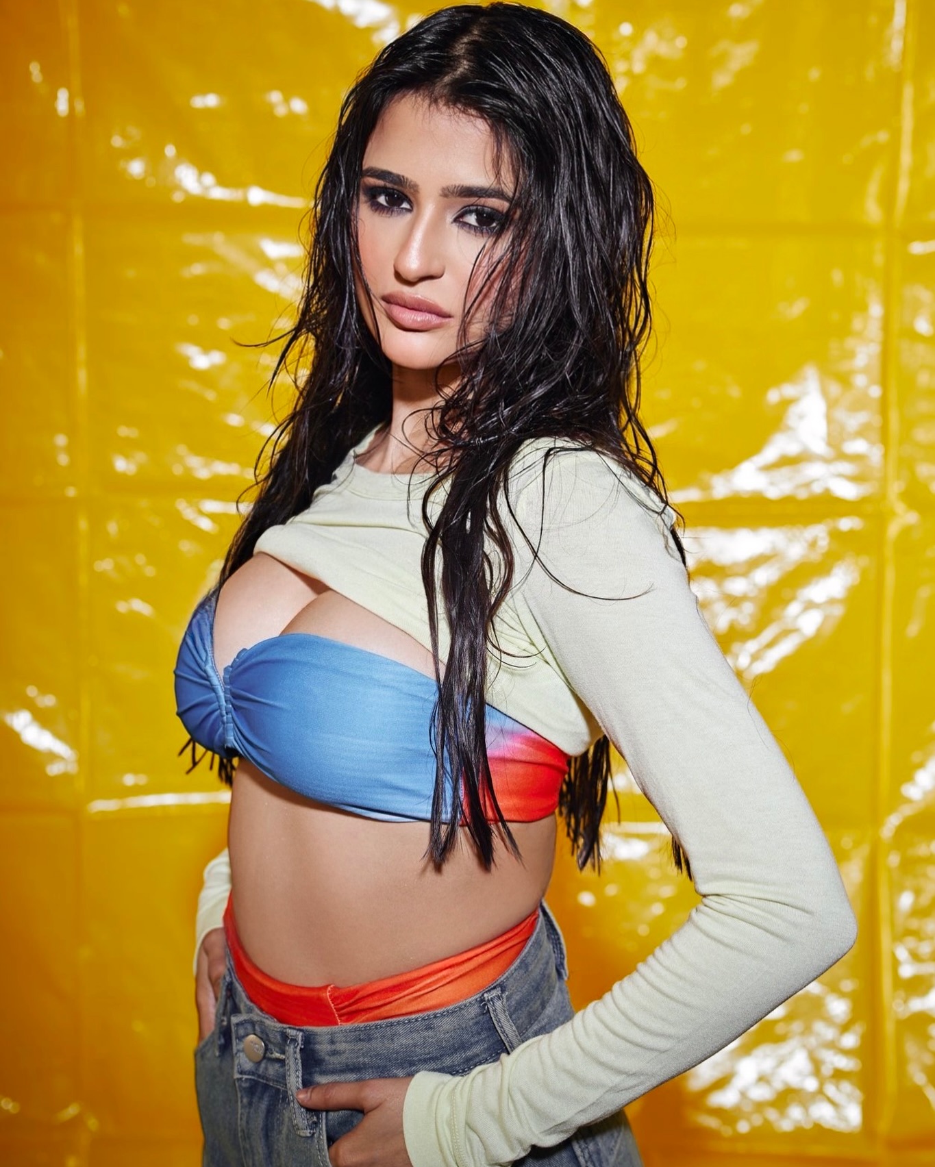 A cerulean chiffon dress offers a study in light materiality. The minimalist design achieves its impact purely through the quality of the sheer textile. The fabric is exceptionally light, creating a delicate, soft volume around the body. The color, a vibrant sky blue, is rendered with high chromatic intensity. The sharp shoulders of the design anchor the ephemeral quality of the chiffon. This piece is a demonstration of how minimal structural intervention can yield a high degree of visual saturation and ethereal form.
Courtesy: @prackritipavani/Instagram
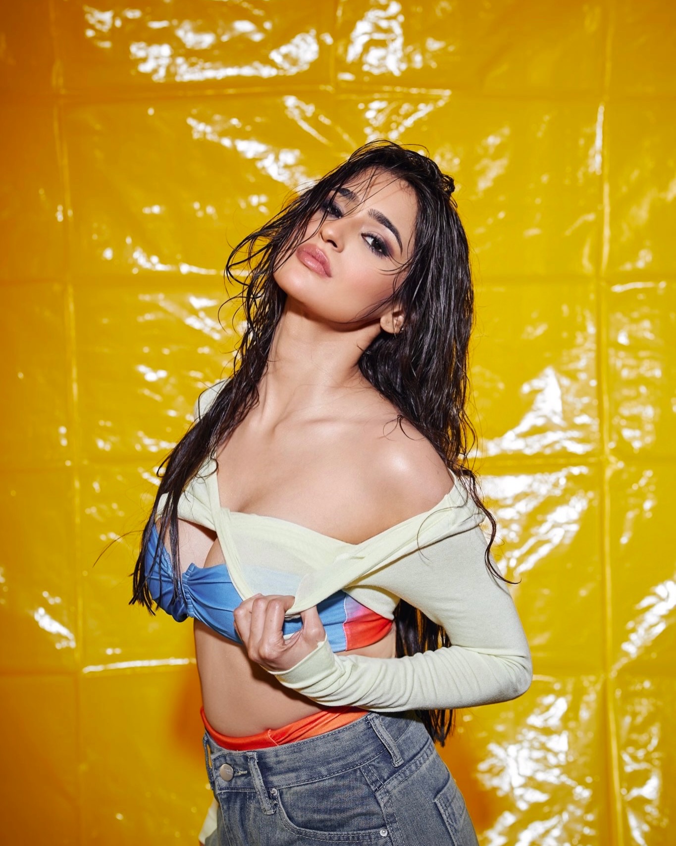 Charcoal gray wool defines the geometry of this double-breasted trouser suit. The material is heavy, designed to hold a dramatic, almost sculptural drape. The construction highlights the sharp angles of the lapels and the precise break of the trousers. This specific shade of charcoal allows the texture of the wool to become the primary visual element, offering a depth of shadow. The double-breasted front adds a specific, historical severity to the overall tailored profile.
Courtesy: @prackritipavani/Instagram
Style Notes
The technical success of this outfit lies in the careful calibration of color theory. The electric blue top, being a highly saturated shade, demands attention. This intensity is balanced by the relaxed fit and the neutral wash of the denim jeans, which prevent the overall composition from becoming overwhelming. The blue and orange pairing is a calculated contrast, and the addition of soft ivory acts as a crucial intermediary tone, softening the transition between the high-chroma blue and the warm orange accents.
The silhouette maintains a relaxed profile. The jeans are deliberately cut with a relaxed fit, contrasting the structured texture of the top. The top itself is characterized by its ruched construction, which adds micro-texture and volume, elevating the basic denim pairing. The ivory layer is styled as a loose drape, adding a vertical element and a sense of movement without competing with the blue’s intensity.
This ensemble provides a case study in utilizing texture and color placement. The fabric of the blue top provides the necessary visual interest, while the denim maintains the wearable, casual element. The orange is not used in a large block of color, but as a targeted accent—a strategic flash of contrast. This demonstrates that a single, well-placed complementary color can achieve a disproportionately large impact, proving that complex styling is not necessary to achieve a high-impact visual result.
Photos courtesy of
@prackritipavani
Follow on Instagram
Share this post
Add to Google Preferred Sources